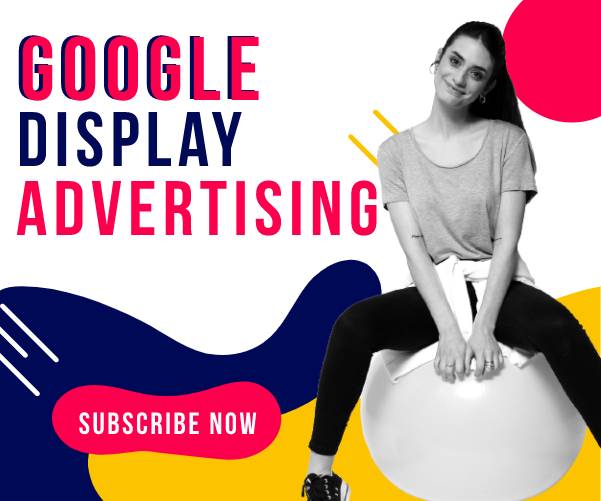
In this post, we are going to talk about one of the most difficult aspects of design work: Display Advertising.
To design an ad that converts is a kind of art that combines graphic skills with marketing and communication techniques. So let’s check out what you need to consider when you are designing a display campaign.
Let’s start with the beginning.
What is display advertising?
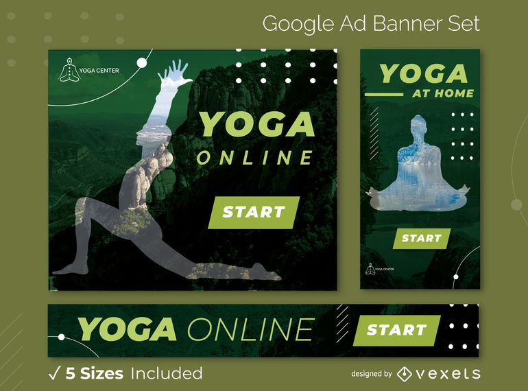
Display advertising is to announce a product or a service through visuals like images, illustrations, or videos on Google networks. Google will place the ads on relevant third-party websites in the form of banner images of different sizes and ratios.
This advertising method is very popular and reaches a huge audience. Google can choose the websites where to show every ad and the people that will target to fit your product or service. This way you can be sure to reach potential customers.
One of the disadvantages is the size of the competition in this network, which forces you to be fresh and original to stand out. Also, the audience is more used to being exposed to advertising on the internet and is more likely to ignore it.
So that’s why we need to be mindful and careful in our designs if we want to achieve our goal. Let’s take a look at more stuff to be aware of.
Structure and sizes
The size of the ad affects its structure and distribution. There are many sizes available but some of them are more efficient than others. Those are the ones with more CTR (click-through rate) but this measure can change from one advertisement to another, so the best practice is to try out some of them and measure which is the best for our product or service.
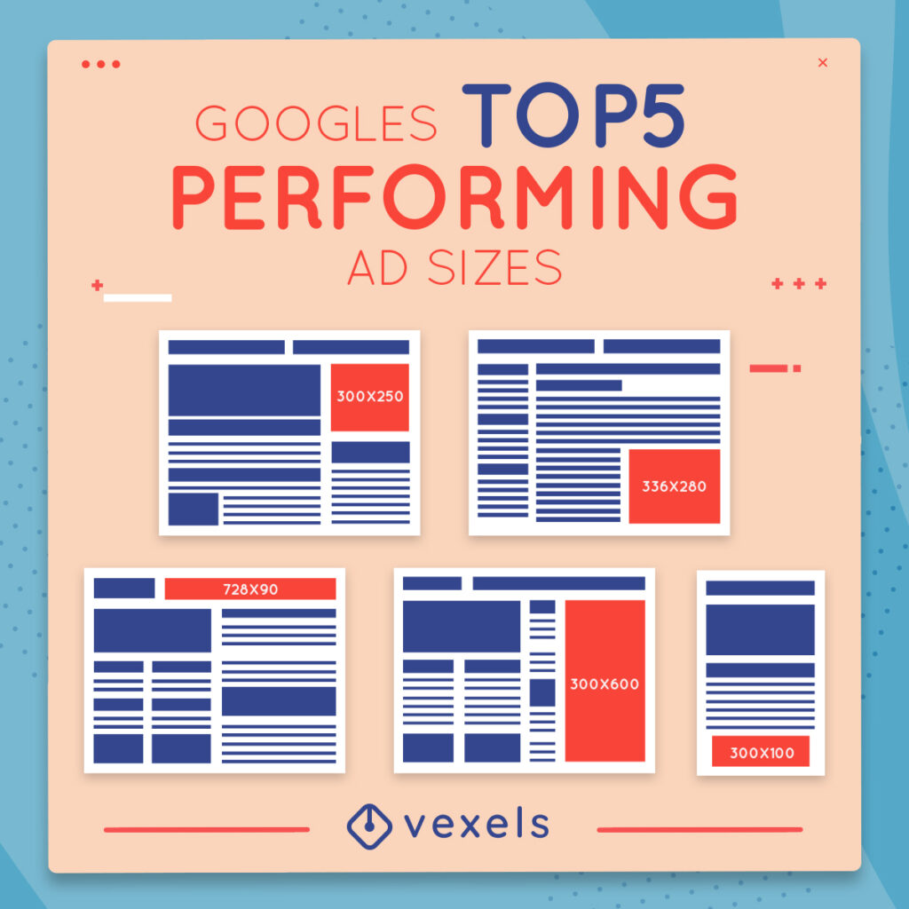
The things that must appear in every ad you design are:
- The company’s logo
- A value proposition
- An image of the product or service you offer (some small sizes ads can leave aside the image or move it to the background)
- The CTA (Call To Action) Button
Style
When picking the style of your ad design it must be related to the company identity and it should fit the value proposition, but also there are two things to consider that can decide the final design.
- Your ad must be easy to understand
Remember that only 9% of the total ads displayed in the Google network are seen for one complete second. And only 4% achieves 2 seconds of attention. So the message you want to deliver must be understood quickly. - Your design needs to catch the attention of the viewer.
For the same reason, you have to design an ad with the contrast to catch the eye of your customers. The colors and images you use will be determinant in attracting clicks.
Copy
Keep in mind that a lot of the viewers of your ads will navigate in mobile browsers. So the sizes of your ad will be 300 x 50 pixels or so. Try to write 5 or 6 words in this small space and you will understand the challenge.
The copy must be short and valuable. It’s a very difficult task to get a copy for your ads so be sure to invest the time you need to get the best catchphrase.
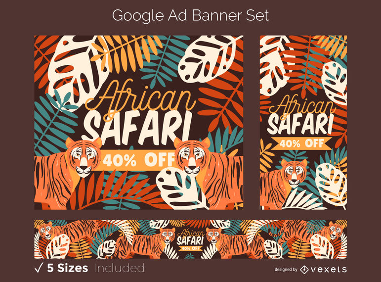
CTA
The ads that convert the most are the ones with clear CTA buttons. They need to invite the visitors to click and convert. The CTA button is the icing on the cake of the good ad strategy, be sure to contrast colors to foreground it to catch the attention and maximize clicks.
Also, take care of the text in the button to ensure that it is a real call to action. When your ad convinces someone to click it has to be clear what they will find when clicking it.
Resources to design a Display Ad
In Vexels there is a huge collection of resources to design your Display Ad. SVGs, backgrounds, and a gigantic selection of sets of banner ads you can edit to fit your needs in a blink of an eye.
Whatever your product or service is and however your style is, in Vexels there is a template that fits your campaign. You can check our ad templates here.

